Fishbar

Complete Branding | Design for Print

Straight-up and simple fish suppers

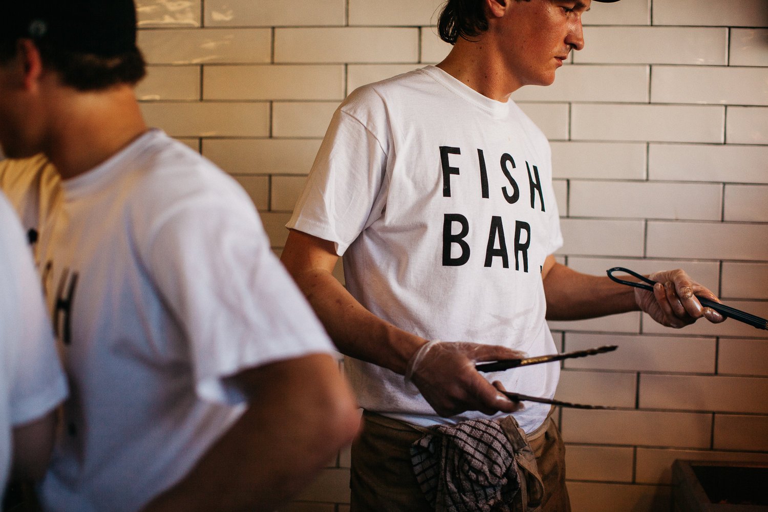
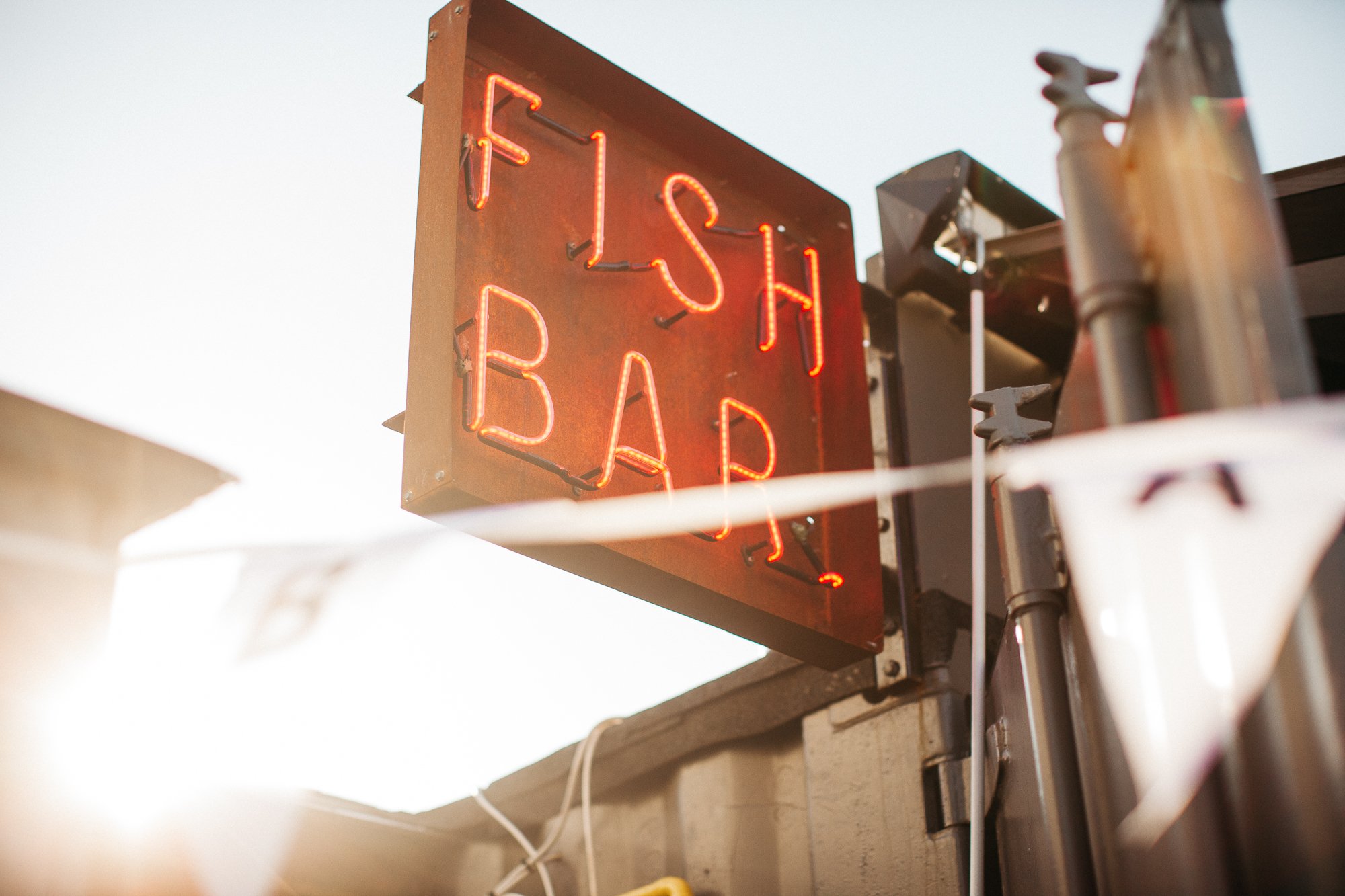
We were asked to create the full design and identity for Fishbar. The key element of the brief was to create a brand that was simple, clear and to the point. It was important that the customers trusted the freshness of the fish and knew what to expect even before coming through the door.

The logo, colour palette, visual identity and copy writing all followed this pattern giving the brand a clarity and simplicity that lacked fuss or pretence.

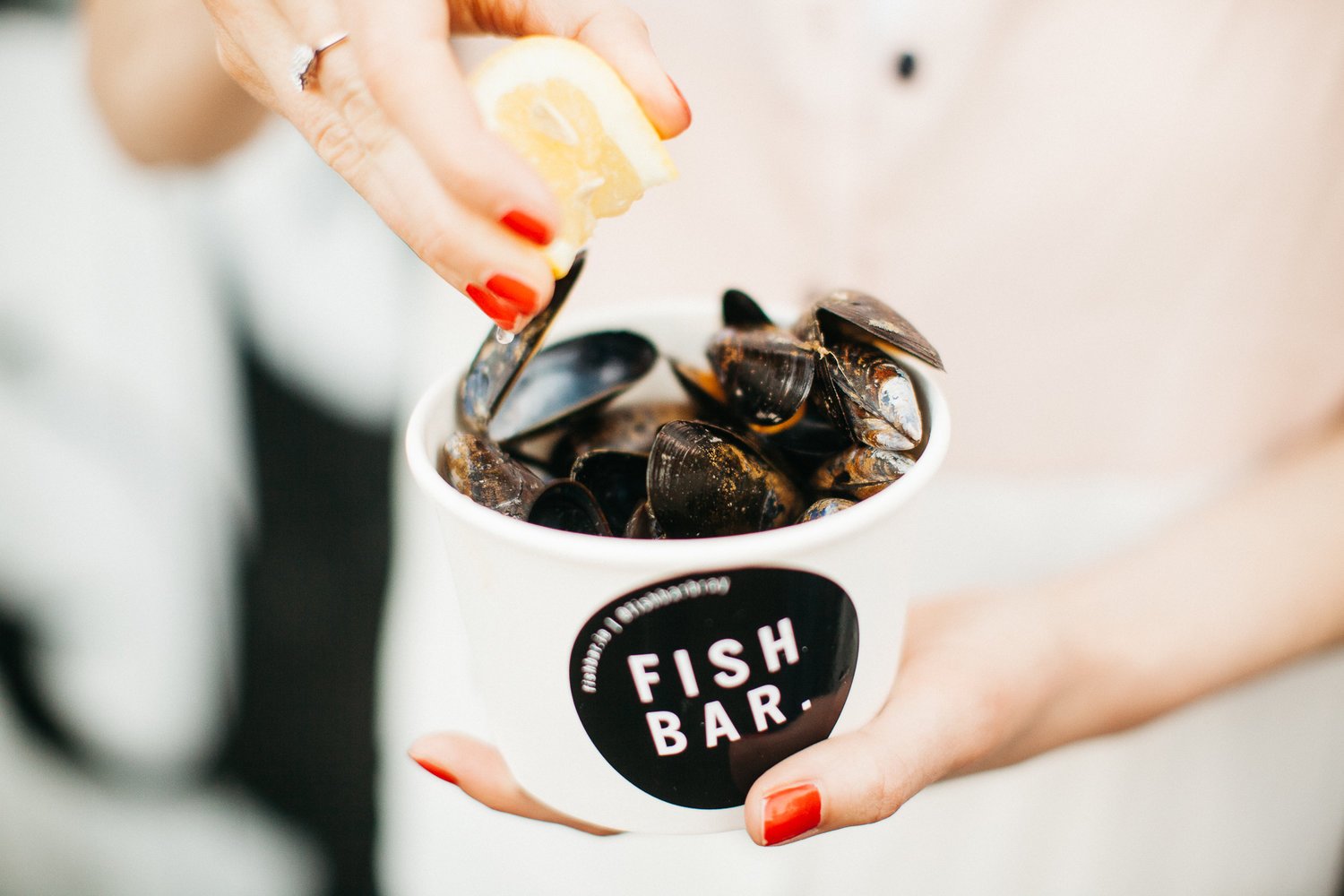
As we used a black, white and grey colour palette in the visual identity, we used food photography to add splashes of colour to the brand. This added a feeling of freshness and life but also showcased the dishes in a clear and uncluttered way, allowing emphasis be on the food. As it should be.